Supported Games


- Backpacks3.11.*
- Features
- Screenshots
- Required plugins
- Installation
- Permissions
- Commands
- Configuration
- Localization
- Limitations
- FAQ
- Doesn't the Backpacks plugin already have a button feature?
- Wouldn't it be better for performance to have this in the Backpacks plugin itself?
- Why isn't this just part of the Backpacks plugin?
- I really like the features of this plugin; will they ever be added to the core Backpacks plugin so I can have one less plugin installed?
Features
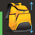
- Allows players to open their backpack via a highly configurable belt button
- Allows players to choose from a selection of alternative button positions
- Allows players to hide the button
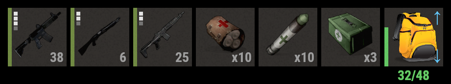
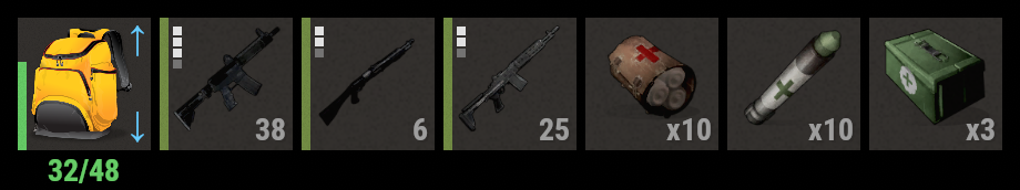
- Allows displaying whether the backpack has Gather or Retrieve mode enabled
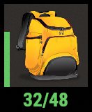
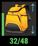
- Allows displaying a bar that indicates how full the backpack is
- Allows displaying the number of occupied and total slots in the backpack
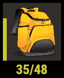
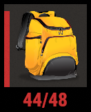
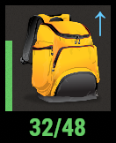
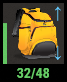
Screenshots


Required plugins
- Backpacks v3.11.0 or newer
Installation
- Add the plugin to the
oxide/pluginsdirectory of your Rust server installation. - If you want to disable the button by default (requiring players to enable it for themselves), set
Default button positionto""in the config and reload the plugin. - Grant the
backpackbutton.usepermission to users or groups who you want to see the button. For example, run the commandoxide.grant group default backpackbutton.useto allow all players to see the button.
The Backpacks plugin will automatically disable its built-in GUI button when it detects the Backpack Button plugin.
Permissions
backpackbutton.use-- Allows players to see and toggle the backpack button.
Commands
backpackui-- Displays help information about how to use the command, as well as the available button positions.backpackui <position>(Left|Right|Toggle|Off) -- Changes your preferred backpack button position. UseToggleto show or hide the button without changing preferred position. UseOffto hide the backpack button.
Configuration
Default configuration:
{
  "Commands": [
    "backpackui",
    "backpackbutton"
  ],
  "Background": {
    "Enabled": true,
    "Color": "0.969 0.922 0.882 0.035",
    "Sprite": "assets/content/ui/ui.background.tiletex.psd"
  },
  "Gather mode indicator": {
    "Enabled": true,
    "Color": "0.4 0.8 1 1"
  },
  "Retrieve mode indicator": {
    "Enabled": true,
    "Color": "0.4 0.8 1 1"
  },
  "Occupied & total slots": {
    "Show occupied slots": true,
    "Show total slots": true,
    "Offset min": "0 -18",
    "Offset max": "60 0",
    "Text align": "MiddleCenter",
    "Default color": "0.4 0.8 0.4 1",
    "Enable dynamic color": true,
    "Dynamic color by fullness percent": {
      "70": "0.8 0.8 0.2 1",
      "80": "0.8 0.4 0.2 1",
      "90": "0.8 0.2 0.2 1"
    }
  },
  "Fill bar": {
    "Enabled": true,
    "Width": 4.0,
    "Sprite": "assets/content/ui/ui.background.tiletex.psd",
    "Default color": "0.4 0.8 0.4 1",
    "Enable dynamic color": true,
    "Dynamic color by fullness percent": {
      "70": "0.8 0.8 0.2 1",
      "80": "0.8 0.4 0.2 1",
      "90": "0.8 0.2 0.2 1"
    }
  },
  "Default button position": "Right",
  "Button positions": [
    {
      "Name": "Left",
      "Enabled": true,
      "Offset X": -263.5,
      "URL": "",
      "Skin ID": 3050420442,
      "Image size": 56.0
    },
    {
      "Name": "Right",
      "Enabled": true,
      "Offset X": 185.0,
      "URL": "",
      "Skin ID": 3050420772,
      "Image size": 56.0
    }
  ]
}
Commands-- Determines which commands can be used to change button preferences.Background-- Controls the background panel behind the backpack image.Enabled(trueorfalse) -- Determines whether the background panel is enabled. Default:true.Color-- Determines the color of the background panel. Default:"0.969 0.922 0.882 0.035".Sprite-- Determines the sprite of the background panel. This must be a valid client-side asset. There is no definitive reference for all known client-side assets, so if you want to customize this, you are on your own. Default:"assets/content/ui/ui.background.tiletex.psd".
Gather mode indicator-- Controls the display of the Gather mode indicator, which is displayed while the player's backpack has Gather mode enabled for at least one page.Enabled(trueorfalse) -- Determines whether the Gather mode indicator is enabled. Default:true.Color-- Determines the text color of the indicator. Default:"0.4 0.8 1 1".
Retrieve mode indicator-- Controls the display of the Retrieve mode indicator, which is displayed while the player's backpack has Retrieve mode enabled for at least one page.Enabled(trueorfalse) -- Determines whether the Retrieve mode indicator is enabled. Default:true.Color-- Determines the text color of the indicator. Default:"0.4 0.8 1 1".
Occupied & total slots-- Controls the display of the occupied & total slots text. If both occupied and total slots are enabled, you will see text like "15/48". If only one number is enabled, you will see just that number.Show occupied slots(trueorfalse) -- Determines whether the current number of occupied slots is displayed. Default:true.Show total slots(trueorfalse) -- Determines whether the backpack's total capacity is displayed. Default:true.Offset min-- Determines the X and Y coordinates of the bottom left point of the invisible box that contains the text, relative to the bottom left of the backpack button.Offset max-- Determines the X and Y coordinates of the top right point of the invisible box that contains the text, relative to the bottom left of the backpack button.Text align-- Determines the text alignment. Default value:"MiddleCenter".- Allowed values:
"UpperLeft","UpperCenter","UpperRight","MiddleLeft","MiddleCenter","MiddleRight","LowerLeft","LowerCenter","LowerRight".
- Allowed values:
Default color-- Determines the default text color. The displayed color may be different, if you have set"Enable dynamic color": true. Default value:"0.4 0.8 0.4 1".Enable dynamic color(trueorfalse) -- Determines whether dynamic text color is enabled. Default:true.Dynamic color by fullness percent-- Determines the text color according to how full the backpack is.
Fill bar-- Controls the display of the fill bar, which indicates how full the backpack is.Enabled(trueorfalse) -- Determines whether the fill bar is enabled. Default:true.Sprite-- Determines the sprite of the fill bar. This must be a valid client-side assets. There is no definitive reference for all known client-side assets, so if you want to customize this, you are on your own. Default value:"assets/content/ui/ui.background.tiletex.psd".Width-- Determines the width of the fill bar. Default:4.0.Default color-- Determines the default color of the fill bar. The displayed color may be different, if you have set"Enable dynamic color": true. Default:"0.4 0.8 0.4 1".Enable dynamic color(trueorfalse) -- Determines whether dynamic text color is enabled. Default:true.Dynamic color by fullness percent-- Determines the text color according to how full the backpack is.
Default button position-- Determines the default button position. Set to""to disable the button by default. This value must correspond to a positionNamein theButton positionssection that hasEnabledset totrue. Default:"Right".Button positions-- Determines the available button positions.Name-- Determines the name of the button position. This name is used to generate a localization option, and can be referred to byDefault button position.Enabled-- Determines whether this button position can be used.Offset X-- Determines the X offset of the bottom left corner of the button, relative to the bottom center of the screen.URL-- Determines the button image. Will have no effect ifSkin IDis not0.Skin ID-- Determines the button image, using a rust skin. Set to0to useURLinstead. Default:0.Image size-- Determines the size of the image. Recommended to go no higher than60.0, especially if you have the background enabled. Default:56.0.
Localization
{
  "Usage": "Usage: <color=#fd4>{0}</color> <position>\n\nPositions: {1}",
  "Off": "Off",
  "No Permission": "You don't have permission to use this command.",
  "Position.Left": "Left",
  "Position.Right": "Right"
}
Limitations
When a player connects to a server, the button will initially not display the fill bar, occupied slots, or gather and retrieve indicators. That is because the player's backpack has not yet loaded. Once the player opens their backpack, the button will be updated. This is actually useful because it indicates to the player whether gather and retrieve mode are currently active, since they are not active if the backpack has not loaded yet. If you are wondering why the backpack does not automatically load when a player connects, that is a performance optimization in Backpacks to avoid loading data and creating objects that are not necessarily going to be used.
FAQ
Doesn't the Backpacks plugin already have a button feature?
Yes, but that feature is much more limited than what this plugin offers.
Wouldn't it be better for performance to have this in the Backpacks plugin itself?
Not really. This plugin communicates with Backpacks through a high performance API (not through Oxide calls), so there is basically no performance sacrifice to this approach.
Why isn't this just part of the Backpacks plugin?
While the Backpacks plugin does have basic button feature, there have many different requests for additional button features. It's not feasible to keep updating Backpacks to address all of them. It's also not a good maintenance strategy for developers to create alternative versions of the Backpacks plugin. Allowing alternative buttons to be created via addon plugins is the most scalable design. If this plugin doesn't meet your needs, you can fork it, without having to customize the core Backpacks plugin.
I really like the features of this plugin; will they ever be added to the core Backpacks plugin so I can have one less plugin installed?
Maybe someday. Keep in mind that there is little practical advantage to having "one less plugin". This type of plugin will almost never need to be maintained or updated.
Permission is hereby granted, free of charge, to any person obtaining a copy
of this software and associated documentation files (the "Software"), to deal
in the Software without restriction, including without limitation the rights
to use, copy, modify, merge, publish, distribute, sublicense, and/or sell
copies of the Software, and to permit persons to whom the Software is
furnished to do so, subject to the following conditions:
The above copyright notice and this permission notice shall be included in all
copies or substantial portions of the Software.
THE SOFTWARE IS PROVIDED "AS IS", WITHOUT WARRANTY OF ANY KIND, EXPRESS OR
IMPLIED, INCLUDING BUT NOT LIMITED TO THE WARRANTIES OF MERCHANTABILITY,
FITNESS FOR A PARTICULAR PURPOSE AND NONINFRINGEMENT. IN NO EVENT SHALL THE
AUTHORS OR COPYRIGHT HOLDERS BE LIABLE FOR ANY CLAIM, DAMAGES OR OTHER
LIABILITY, WHETHER IN AN ACTION OF CONTRACT, TORT OR OTHERWISE, ARISING FROM,
OUT OF OR IN CONNECTION WITH THE SOFTWARE OR THE USE OR OTHER DEALINGS IN THE
SOFTWARE.